Purple Phase
Identity, Web Design, Web Build
Purple Phase is a new Australian music label founded by 5 friends. Working side-by-side with passionate artists on their journey towards building sustainable global careers. I worked with Russell Fitzgibbon on the rollout of their brand and identity. Russell created the beautiful wordmark and I jumped on to create the expanded identity system and the website design and build.
Collaborator: Russ Fitzgibbon


AFIA
Identity, Art Direction
The Australian Finance Industry Association are the leading advocate and collective voice for advancing Australia’s financial services industry.
We created a monogram that is an innovative visual shortcut of the organisation’s acronym. An inclusive and integrated A, F, I and A, particularly playing into the future currency of ‘Fi’. A key consideration was the logos ability to hold its own within members’ environments, where it is applied to denote business membership to the organisation, as well as business compliance to particular industry codes.
Studio: The Accompany Group


Bailey Nelson
Identity, Illustration, Iconography
Brand refresh for popular glasses retailer Bailey Nelson. We worked closely with the marketing and internal design team to transform their brand from familiar to fresh, with the goal of appealing to an audience of young and old.
Studio: The Accompany Group
Team: Elizaveta Pogossov


Sweetie
Wordmark, Apparel
Wonderful people, sick band. I got to make em a logo and shirt that captures their infectious devo country-punk energy.


Mate
Film Identity
Mate is an award winning short film set in Western Sydney that explores a difficult father son relationship. I was tasked with creating the poster and extended collateral for the film.


KraveBeauty
Identity, Art Direction, Website Design, Packaging, Iconography
With a mission to cut through the noise of the industry and encourage consumers to only buy the products they need (for the benefit of both their skin and the environment), KraveBeauty is a skincare brand that really cares. They approached us in need of a full rebrand that would reflect their no-BS, educational ethos in an approachable and inviting way.
Studio: Universal Favourite
Photography: Benito Martin Anna Pogossova
Brand Writer: Cat Wall
Styling: Jess Johnson
Packaging solution: Think Packaging
+ Team: Sherry Wang


IKU
Identity, Art Direction, Digital, Packaging, Iconography
IKU are a Sydney institution, cooking up delicious plant-based food since the 80's. They came to us in search of a deliciously different visual and verbal identity that would set them apart in the DTC space while still staying true to the roots they put down in their Sydney storefront almost 40 years ago.
IKU’s identity is as vibrant and enticing as the food they create. It’s a beautiful and inviting celebration of all the ways in which (plant-based) food can change your world. By channeling the past and remembering the foundations they were built on, we were able to create a brand for both the future of their business and the planet.
Studio: Universal Favourite
Photography: Benito Martin
Brand Writer: Cat Wall
Styling: Jess Johnson
+ Team: Lucy Mcginley


Universal Favourite
Identity, Website Design, Animation
While working at Universal Favourite I was asked to rebrand the studio. The main aim was to create a brand that gave the studio its own personality but was also adaptable to change. The core of the identity is an ever-changing universe, representing the different clients, approaches, personalities and ideas that flow through the studio each day.
Studio: Universal Favourite
Animation: Never Sit Still
+ Team: Ali Ozden


Pooch Pack
Naming, Identity, Packaging, Illustration
Pooch Pack make delicious dog treats using only the best Australian ingredients. Our approach was to focus on the unique personalities of dogs and the joy that they bring through humorous illustrations and a bright palette.
Studio: The Colour Club
Photography: Karina Lee
+ Team: David Le


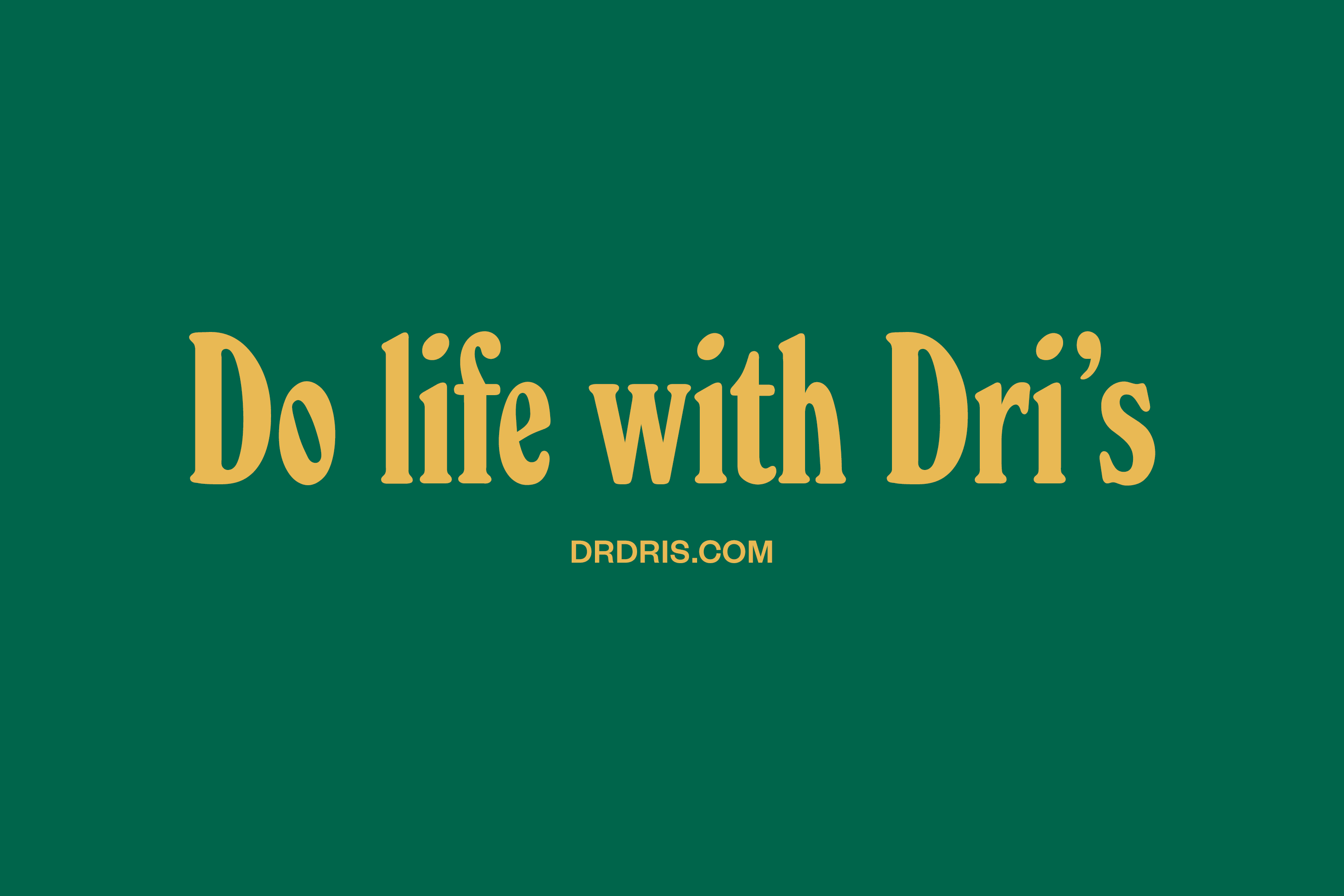
Dr Dri's
Identity, Packaging, Illustration
Dr. Dri’s is a Canadian company that creates all-natural products for the home, starting with (care of “unprecedented times”) a hand sanitiser. Despite its basis in health, it makes its mark as a direct-to-consumer and retail lifestyle brand, with products as beautiful as they are effective.
Studio: Universal Favourite
Photography: Benito Martin
+ Team: Sherry Wang


Shorty's
Naming, Identity
A 6’6” man needed a fresh face and name for a café he’d recently purchased. After much deliberation we realised the name was right under our noses, and thus Shorty’s was born. A pair of wobbly legs became the hero of the brand which we paired with some coffee-themed type lockups. On the award circuit Shorty’s won silver at the Best Awards 2018 and was an AGDA finalist in 2017.
Studio: The Colour Club
Photography: Karina Lee
+ Team: David Le


Stone's Throw
Naming, Identity
A freshly renovated bar and restaurant in Adelaide with a very nice atrium-like courtyard. A modern watering hole for discerning locals. We loved the idea of a go-to local and landed on Stone’s Throw as an irreverent moniker. A set of illustrations, embodied by their oddities, play off the sophisticated logo and allow the venue to feel welcoming and homely.
Studio: The Colour Club
Photography: Karina Lee
+ Team: David Le


